petsoi@discuss.tchncs.de to Linux@lemmy.ml · 1 year agoONLYOFFICE 7.5 Released with New PDF Editor + Morewww.omgubuntu.co.ukexternal-linkmessage-square65fedilinkarrow-up1323arrow-down18
arrow-up1315arrow-down1external-linkONLYOFFICE 7.5 Released with New PDF Editor + Morewww.omgubuntu.co.ukpetsoi@discuss.tchncs.de to Linux@lemmy.ml · 1 year agomessage-square65fedilink
minus-squarenoro_lim_asfaloth@lemmy.worldlinkfedilinkarrow-up7·edit-21 year agoIdk, LibreOffice UI seems pretty decent for me.
minus-squareredcalcium@lemmy.institutelinkfedilinkarrow-up5·1 year agoIt’s this the new UI? It’s been a while since I use LibreOffice and the UI was worse than office 2003.
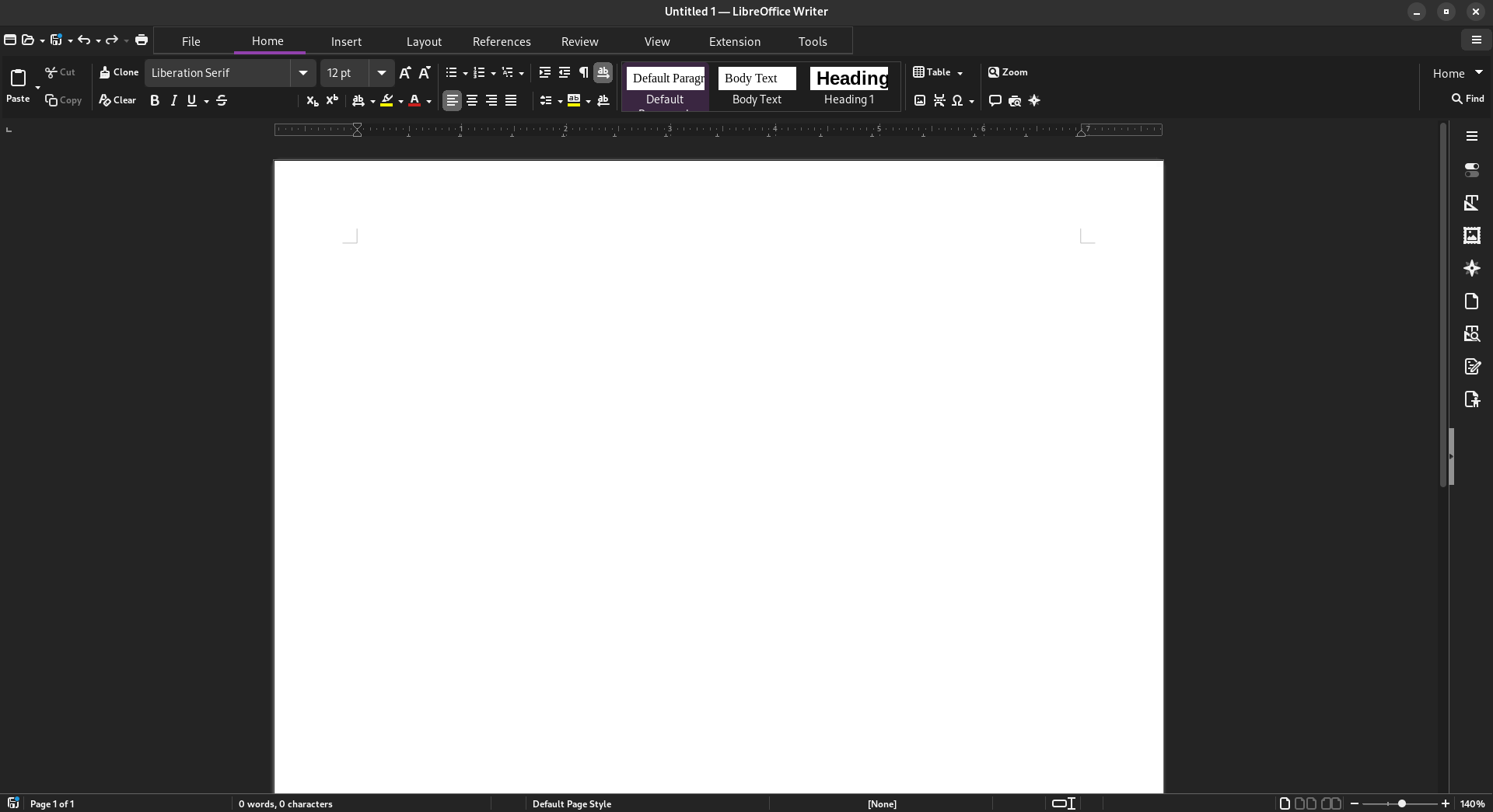
minus-squarenoro_lim_asfaloth@lemmy.worldlinkfedilinkarrow-up14·edit-21 year agoIt’s not a default but I just changed it to tabbed view in the settings, picked Sifr icons in the settings, and installed adw-gtk3 theme on GNOME which makes gtk3 apps blend more with the default libadwaita GNOME theme.
minus-squareredcalcium@lemmy.institutelinkfedilinkarrow-up8·1 year agoIt’s actually not bad! Thanks! Before After
minus-squareAnony Moose@lemmy.calinkfedilinkEnglisharrow-up1·1 year agoNeat, the customization does help make it look a lot better than the defaults. I wonder why they didn’t just make this the new UI.
minus-squareDremor@lemmy.worldlinkfedilinkarrow-up3·1 year agoActually my dad prefer the default UI. But he used Windows 95 and the office suite that goes with it for a long time, so his habits are hard to loose.
minus-squarepascal@lemm.eelinkfedilinkarrow-up2·1 year agoI’m impressed by how they were able to make a worse ribbon interface than Microsoft itself.
Idk, LibreOffice UI seems pretty decent for me.
It’s this the new UI? It’s been a while since I use LibreOffice and the UI was worse than office 2003.
It’s not a default but I just changed it to tabbed view in the settings, picked Sifr icons in the settings, and installed adw-gtk3 theme on GNOME which makes gtk3 apps blend more with the default libadwaita GNOME theme.
It’s actually not bad! Thanks!
Before
After
Neat, the customization does help make it look a lot better than the defaults. I wonder why they didn’t just make this the new UI.
Actually my dad prefer the default UI. But he used Windows 95 and the office suite that goes with it for a long time, so his habits are hard to loose.
I’m impressed by how they were able to make a worse ribbon interface than Microsoft itself.