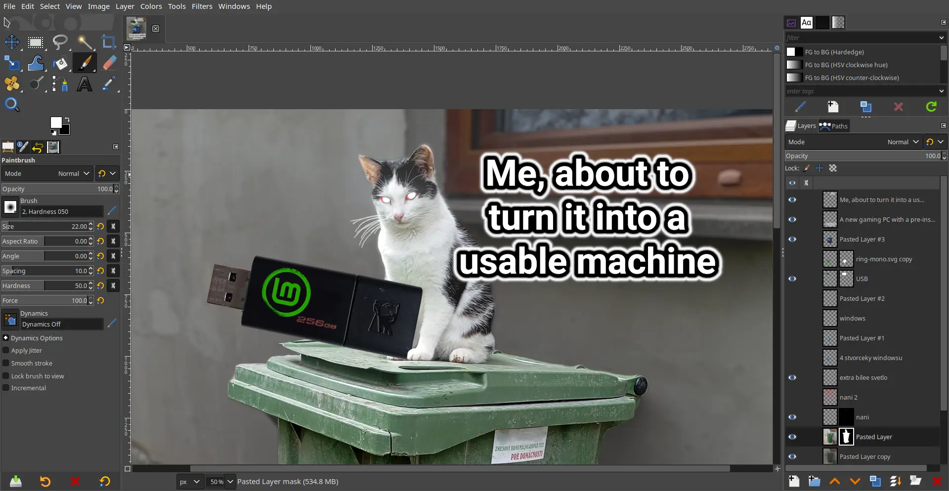
The damn thing was written by a couple of College Students who had no experience with graphic arts and man does it show. The UI has been the number #1 complaint since the 1.0 release back in 1998; how it’s never been updated / overhauled is simply beyond me.
The damn thing was written by a couple of College Students who had no experience with graphic arts and man does it show. The UI has been the number #1 complaint since the 1.0 release back in 1998; how it’s never been updated / overhauled is simply beyond me.
It looks good to me…
Why? Looks basically the same as photoshop, which everybody seems to love.
Among other things:
You can change the icon theme in the settings to a color one. That’s what I always do. The scaling can be changed as well.
May I ask what are some of the arcane options supposed to be?
How do you change scaling of buttons?
Not at PC for a few days but IIRC I was overwhelmed whenever going through any drop down menu.
Edit > Preferences > Interface > Icon Theme > Custom icon size
Newer versions of Photoshop have like 8 buttons and a toolbar which is terrible imo.