Hey all, newbie to the Lemmy, signed up recently.
Also a relative android newbie, I’ve had a pixel 6 for about a year and a half.
I’ve played around with tasker, KWGT, KLWP, and all kinds of other power-user techie apps, so I’m reasonably confident in my ability to tinker with my phone.
I’ve been experimenting with my launcher, having gone with stock pixel launcher for my first half, and then using Lawnchair 12 for the second half, I wanted to try something new.
So, I open the floor up to you guys! What launcher are you using, what do you enjoy, and most importantly, why do you enjoy it? What sets your launcher apart?
KISS operates on a totally different paradigm than most launchers. Instead of having a grid of rearrangeable app icons, your home screen is simply a list of your most recently used applications (icon, name, and keywords). You also have a search bar where you can type to search for your application. This keyboard-focused launcher is very similar to how I open programs on desktop, so it is very welcome on mobile as well.
I can’t live without KISS launcher anymore. It has just the right number of options and allows me to find and launch the app I want very quickly. Also, it resemble the way I am used to launch program on my desktop.
Same. Do you use the tag feature? I have put it to good use after some tweaking. I won’t be able to live without KISS either going forward.
Yes I do use tags to group some less used apps which maybe I don’t remember the exact name. For example I have some utilities apps (water, electricity, heating) which I use sometime to check my bills and they share the same tag, so I don’t need to remember the exact name of the app.
I got so sick of the generic grids and app drawers, but then I found Niagara Launcher and it’s just the single coolest thing I’ve ever used.
I love the completely unique home screen, and I insanely love that each app icon can be swiped on and opened as a folder/access in-app shortcuts.
I really can’t recommend it enough for anyone looking for something super far from the average cookie-cutter launcher templates.
Lawnchair. It’s FOSS and like the old Nova launcher, before they were acquired.
Thanks for posting this! It’s super timely as I’m a long-time Nova Launcher Pro user but been experimenting with the Niagara Pro unlock. I think I like it, but I’m not sure I like it enough to spend $30 on it.
NeoLauncher needs a top level comment here! It’s a lifesaver after Nova was sold off to a marketing company!
So many FOSS launchers are trying this search based or text oriented thing and sorry, I can’t stand it. I just need to be able to unlock my phone and hit an app icon from a grid of selected apps and web shortcuts on my home screen.
I have been using Smart Launcher 6 for quite a while. Some of its features that I really like are:
*categorized app drawer
*Smart widgets developed by the Smart Launcher team, such as the widget stack, music widget, notes, calendar events, icon group widgets…
*Smart Launcher has a fine positioning tool that allows you to move the widgets with very precise positioning so that you can put them exactly where you want them, it also allows you to resize them
*The news page, which you can either use Microsoft News or Google Feed
*Great search function, it will search for apps, web, contacts, calendar, settings, shortcuts, and Play storeYou forget one. Dynamic theme. The launcher changes theme colors based on wallpaper color.
Yes, you’re right! The launcher has so many great features, it’s hard to name them all.
shade launcher
Interestingly, it’s telling me this:
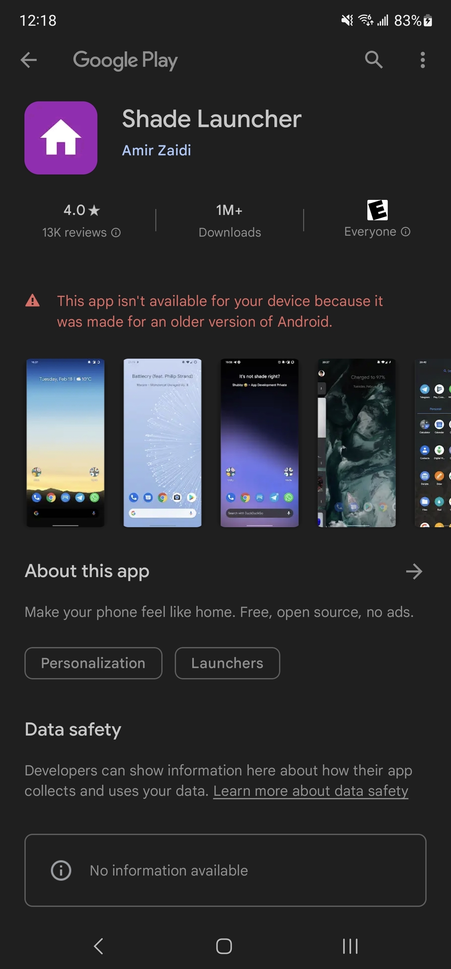
Did you ever find a resolution for this? I’m encountering this same issue with KWGT packs
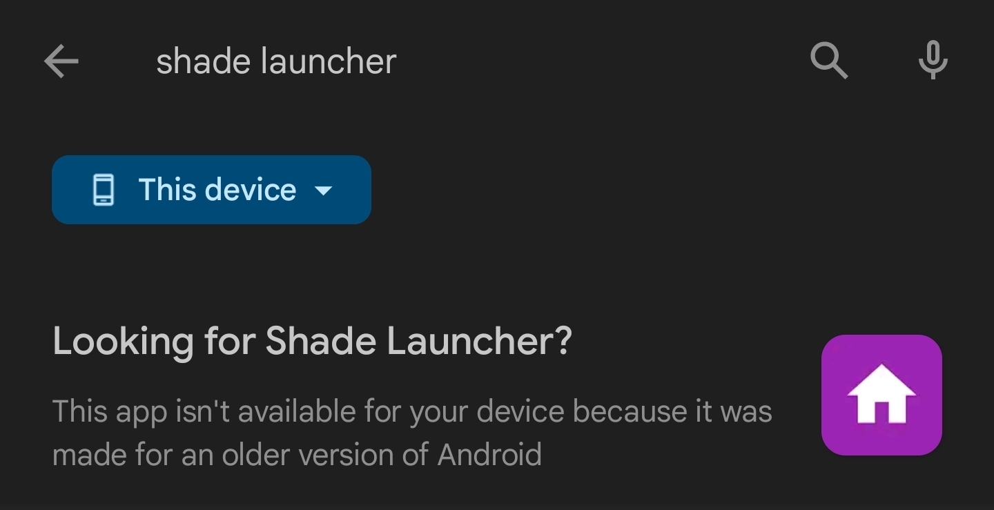
No resolution, but it seems to just be too out of date.
Kvaesitso is gorgeous
Found it a couple of days ago, it’s gorgeous indeed.
But I switched back to Niagara because the animations felt a bit luggy, especially when the keyboard was showing up. Can’t wait to try it again in the future.
@Kevin11 I have been using https://apt.izzysoft.de/fdroid/index/apk/app.lawnchair and it is small amd clean launcher.
I initially tried the Play Store version and it almost replaced Nova but not quite. I think my autism and OCD makes these things harder for me.
I then tried the alpha build which was closer still but not quite. I want the dock icons to sit on the bottom of the screen, not one row up.
But thanks for the link, I’ll keep an eye on any further developments.

