

You must log in or register to comment.
Tbh I don’t see where this is bad (except maybe the 0 label). Why should “up” always be “better”? There are countless other examples where this is not the case. Or am I missing something here?
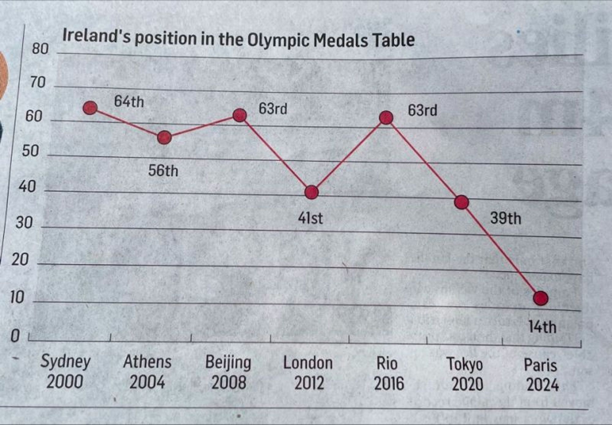
It measures place, rather than performance (like medals got). It’s a line graph, when there’s no events between the data points, so it should be a bar graph. And yeah, up is better.
A bar chart for this kind of data makes no sense to me as the bar doesn’t really represent anything. A scatter plot is a good choice and adding a connection line for readability is imo not so bad. It should however be inverted going up to 1 and not down to 0.
Line chart is fine here as it’s the same measure over time.
are there any communities for bad graphs ? :))
//edit: changed their to there
c/dataisugly
Are there any communities for misuse of their/there/they’re? /lh
Their must be one. Plz create they.
*Their must bee won
At this rate in 2028 they’ll be at -11th
The values are even incorrect. 2008, they got 63rd. 2024 they got 19th.
…does it not say 63rd for 2008?
Yeah it does. I fucked up, they actually placed 64th and not 63rd. Importantly I’m not a reporter.


