
I’d like Lemmy to attract a wide range of folks who contribute to a diverse range of communities. While the official web UI is very rich in features, I think it might be a bit intimidating for non-IT people.
So I figured: why not try to be the change I want to see in this world? Here’s my attempt, implemented in SvelteKit.
I really don’t like that style of interface. But what’s cool is, it doesn’t matter what I think, because both can coexist so people who do like it can enjoy it. Looks good, Rock on!
Like not everyone liked new reddit UI, and not everyone like the old UI.
Having a choice is always better than force people to use something they don’t like. (this reminds me something!)No worries. Here’s to freedom of choice!
Will it be open source?
Late to the party here but this is exactly what I’ve been thinking Lemmy needs to attract the less tech-savvy folks who absolutely don’t need/want all the hyper specific info and features! Well done!
I know I’ll get pushback for this, but I’d like to see something like this become the default so new people don’t get scared away because it’s “too complicated” and then the current one become hosted under a subdomain for all the techie folks who like the control/info.
Thank you! There’s obviously still quite a way to go, but I’m hoping I or someone else will get there eventually.
I agree that defaults matter a lot. You get only one chance to make a first impression, and most people will probably decide within a few seconds whether Lemmy is worth exploring. We need to get those users excited to explore the platform.
Granted, some people may be scared that it’s going to “dumb down” Lemmy. But Lemmy will always continue to be about freedom of choice: you pick an instance you like, instances can offer any selection of web UIs they want, and you pick from the offered web UIs.
Well said! This was far and away the most common complaint while I’ve been telling folks about Lemmy on Reddit, and I think plopping them right into a familiar, simple design would go a long way. At any rate, it’s good to see more UI people get involved since it feels a little neglected among the 3PAs and front ends, in my opinion.
My other main complaint was that people don’t get how or where to sign up, and join-lemmy.org is just a bad introduction to the concept of instances. Would love to see that piece of Lemmy improved as well!
You’re hitting the nail on the head. Reddit-style websites are familiar to a lot of people, but we need to do a better job of explaining instances and federation. Not with text or technobabble, but with a UI that’s so intuitive it almost speaks for itself.
Thanks, official lemmy interface is clunked. this looks better tbh
I like it a lot, but would be cool to have a 2 column layout as an option like Mastodon app trunks.social has.
Awesome stuff! More is better, and webUIs are, I think, a better avenue for UI diversity than mobile apps.
Not to detract from your work, but it seems somewhat similar to
alexandrite(see their community here), both in the general layout and using svelte. I bring this up just in case you weren’t aware and there’s any possibility of the two projects being merged or pooled or at least learn from each other in some way.Otherwise … awesome work! I’m a fan of columnar layouts!
I think this UI looks neat, totally room out there for both of them! :) I think it actually looks a bit closer to Photon. I’m always down for more apps because we all benefit from new ideas.
Prior to starting my own web UI I considered becoming an Alexandrite contributor. I like how colorful it is compared to the regular web UI. My vision is too different from a technical, design and UX perspective though, so I still think it’s worth pursuing a separate effort. I hope it’ll pay off.
Awesome! Best of luck!
I loved it, I hope it is implemented as soon as possible. I hate the current interface.
it seems like my comment was deleted. what is the link again?
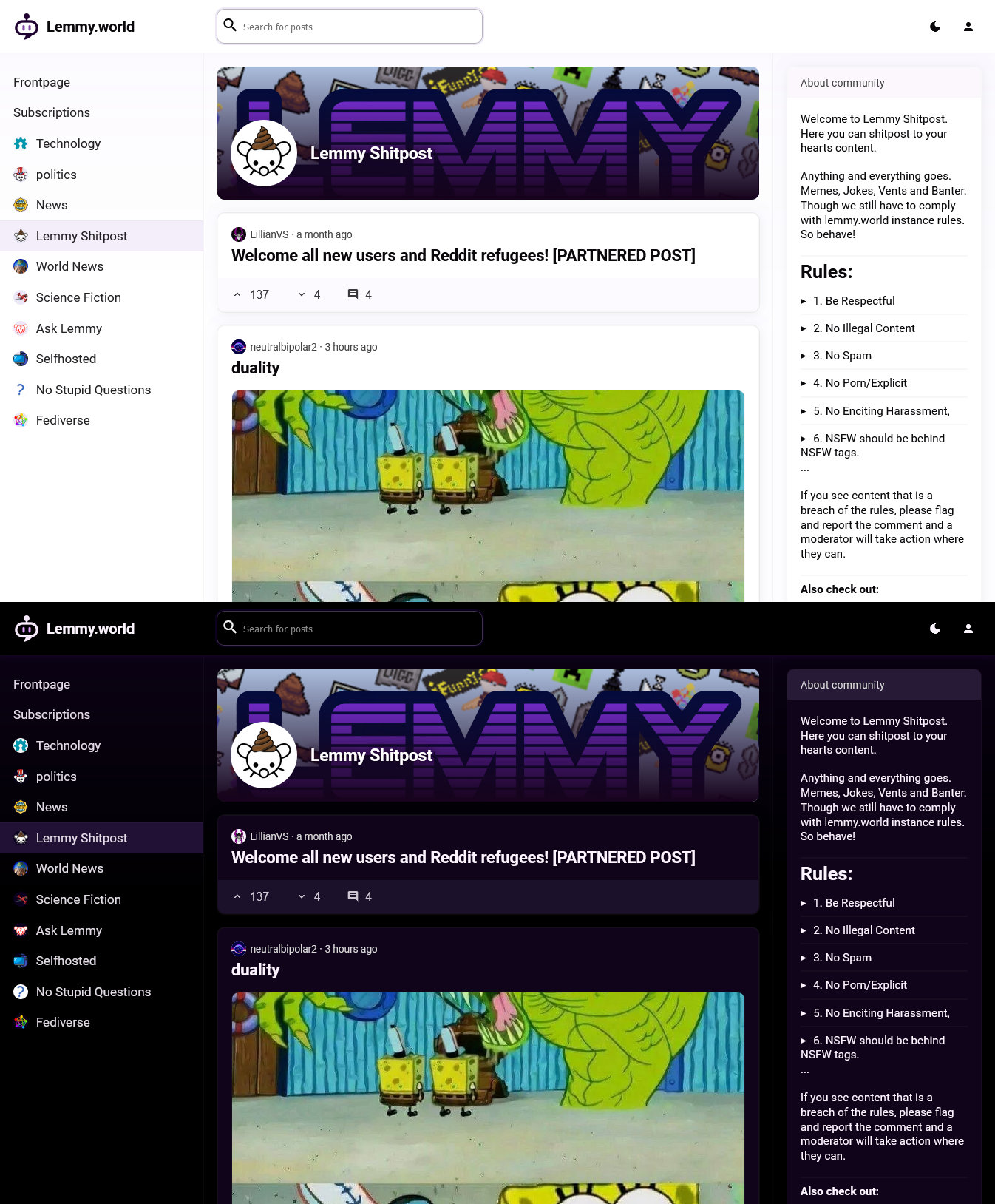
The link is https://lemminator.netlify.app/. While it’s still very much a work in progress, basic navigation and upvote/downvote are already working.
thanks
Love it !
is there a public beta, i would love to try it
The prototype is live at https://lemminator.netlify.app/ now! You’ll notice that it’s still readonly, so not quite ready to be a daily driver, but gotta start somewhere.
This looks nice, could it be used in any browser? I use Safari and it has a pretty dumb support for extensions.
I don’t have macOS/iOS available to test on, but in theory it should. I have a prototype up and running at https://lemminator.netlify.app/.
I tested it and I think it looks lit, all I want from a Lemmy web UI for desktop is to mimic how good the apps for Android/iOS does, in the meaning of having big ass images without clicking anything else to expand them every single time, I mean, you would think most folks have big ass monitors in use already (I don’t but at least is bigger than my smartphone screen).
Only feature I have yet to see on this kind of frontends is the ability to mark posts as read while you scroll and hide them as well (like you can with Summit and Voyager).
Another thing I am not a fan of the dark mode, maybe if you could tweak the interface would be good.
Overall I think I’m gonna be rocking your frontend when it gets released because I think yours fit more with my taste and needs :)
No thanks


