
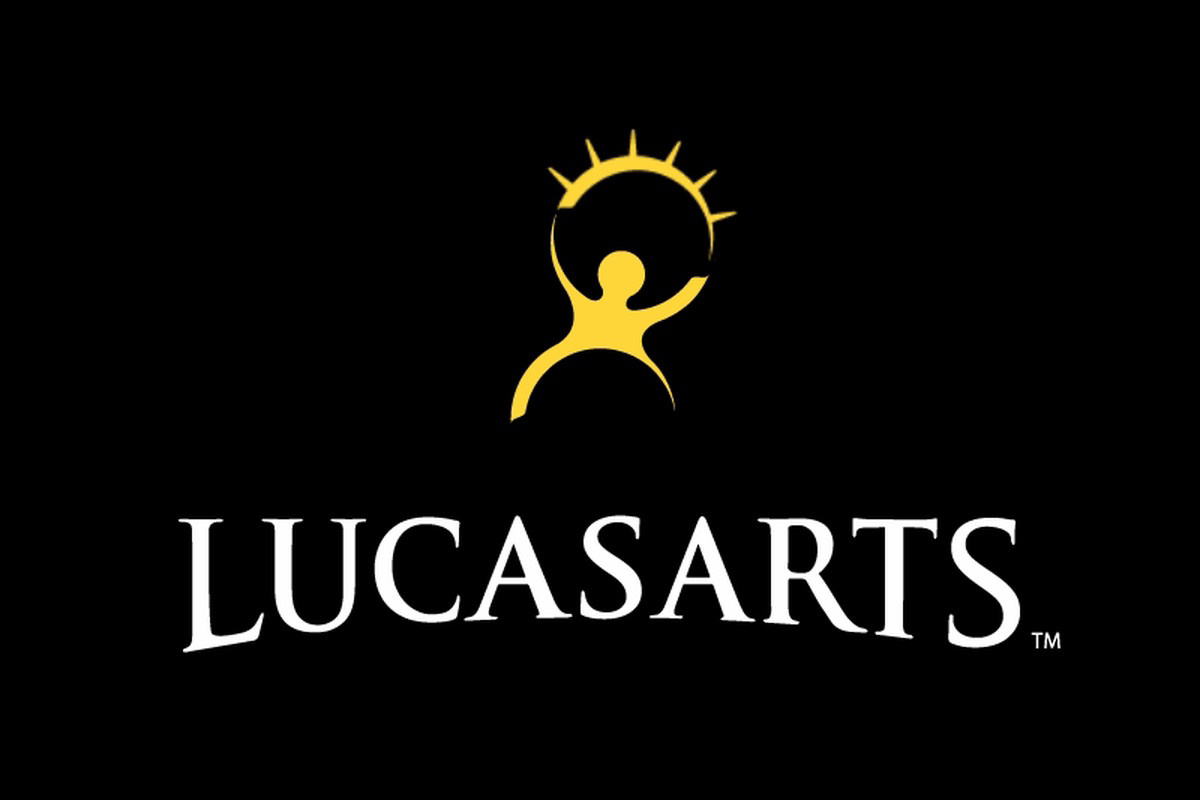
LucasArts?
Man those games were a staple of my childhood
This but the pre-2005 version of the logo was also my first thought.
From the comments, I think that the general answer is: We all recognize it, because a lot of different places used a logo sorta like this in the 90s.
And we can’t pin it down exactly, because a lot of different places used a logo sorta like this in the 90s.
And being the 90s, a lot of that was never on the internet in the first place.
It rings very strong bells for me, and I don’t think the reason is one that (at the time of this comment) has already been posted… But I can’t for the life of me remember what it was for.
I do remember it was from a PC-related brand
Reminds me of the old LucasArts logo but that wasn’t stars, it was a sun or the top of an eyelid with lashes.
Looks like Jira or Confluence.

Poor OP dreaming about Jira
Could it be Knowledge Adventure? I played some of the JumpStart games growing up.
The problem is that there are a million logos from the 90s that have the same stylized “separate head”. I’m attempting to attach an image to show off some examples. While I absolutely feel like I recognize the logo you’ve posted, I think it could be an amalgamation of many of them.
yes! Wasn’t it blue?
This! I remember the colors being something like a blue background and the person in a lighter blue or a white background with a blue person. Stars were definitely separate
@abcd Stars are yellow?
Yes!! I remember it better now with yellow stars!
The name Creative Arts or similar is bouncing around my brain but damn if google, bing or ddg can help.
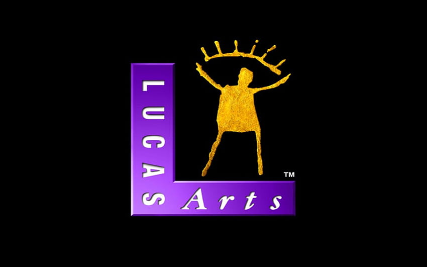
It was purple and gold, right?
Yep!
from howl’s moving castle


